Creating Commission of #1505
Creating Commission of #1505

This piece was created using a multimedia technique of graphite drawing for the base and digital coloring for the final details and refinement. The process took almost 9 years to the day to develop in order to produce this piece, but the actual piece took about 57 hours and over 250 layers to complete.
I created this at the request of a fellow artist on Deviant Art.
The Process
The design was provided by the client. I didn’t not create the design, markings, or anything. I just replicated them as closely as possible into my artwork.
I started with a large graphite drawing to give me enough room to get the level of detail in that I wanted. I used matte graphite pencils so there would be no shine when the image was scanned in that I would have to deal with, and I worked very softly on the paper allowing me a good bit of range.
I don’t think anything was burnished anywhere which allowed me to have an easier time scanning the piece in. Burnishing would have created shinier / mismatched areas and would have caused issues with my stitching process when I scanned it in.
Once the piece was finished and I was happy with the detail level, I scanned it into the computer in sections (I think there was 6 in total) at I high level of resolution and stitched them together in photoshop. This took some nudging and tweaking, but when everything was in place, I flattened the image down and hue shifted slightly to warm it up with a tinge of red/violet rather than the cold gray it started out as.
This is the current state of the artwork:

Next I colored the sky a base color of blue and roughed in the colors for the distant tree/bush that is peeking up from behind the structure on the right.
The sky is a flat gray blue at this point, but the bush/tree has about 8 shade levels of green as well as some hints of brown to work in the visible branches.
I used basic brushes with pressure sensitivity turned on at first, and then worked my way to textured brushes and finally to some specific brush tips that mimicked leaves especially around the edges and where there was sharp contrast between shadow and highlight.
Over the top of all of this I used a pressure sensitive brush with a high level of opacity to make hatching marks in the direction I wanted to indicate for the lighting. Working a layer set to subtract and a separate layer set to divide, I created a more refined placement of shadows and highlights on the greenery.
This is the current state of the artwork:

Then I roughed in the color of the light coming through the windows of the colonnade. There is 3 levels, starting from nearly white in the middle of each window to an orangish yellow on the outside of the window. These colors were gaussian blurred together to soften the transition and then flattened to one layer. This layer will be repetitively used in future effects on the image, but for now it is just left as a single flattened layer at 100% opacity.
On top of that I roughed in the marble grays and whites for the colonnade and the window frames.
I used basic brushes for this as the detail level was not needing to be super high. It’s a distant feature and is really only there for ambient setting. There is nothing special about the structure to speak off, just gave a bit of a courtyard feel to the drawing which is what I was going for.
Over the top of all of this again I used a pressure sensitive brush to make the hatching marks in the same direction as before.
I then took the light layer I painted before and duplicated it, moved it to the top of the colonnade section and set the blending mode to soft light at 100% opacity to give some of that light color reflected off the colonnade and begin to integrate everything together.
This is the current state of the artwork:

Next, I began repeating the process used on the distant bushes before to create the vines and ivy creeping over the edge of the front of the colonnade.
I added the light glow to these vines as well.
I won’t bore you with repeating the process a second time, but the information is above if you want to review it.
This is the current state of the artwork:

The next focus is the tree greenery on the left top corner. The process was the same, but because of the proximity of the tree, I used a little more time with the leaf tip brush to create a real feel of the greenery and less masses of color.
I added the light glow to these leaves as well.
Since there is now very little of the sky showing, the fact that is currently a flat color (it won’t stay that way) is not going to be an issue. You only see the very tiny “square” to the right of the middle when everything is finished. It will basically not be seen at all when all is said and done and all the texturing is complete.
This is the current state of the artwork:

Now I turned my attention to the color of the vines and plants at the rails and the flowers behind the subject. Again, the process was the same, but each section of plants and each flower color has it’s on layer group so I can apply the glow from the windows appropriately.
There is no hatching at this point, it will come later.
This is the current state of the artwork:

I filled in with more of the greenery and added the water on the right hand side.
At this stage there is still no hatching on the new color, but there will be. This is all just the rough color and texture at this stage.
I did add glow to the appropriate areas, and reduced the opacity as we get further and further away from the windows.
This is the current state of the artwork:

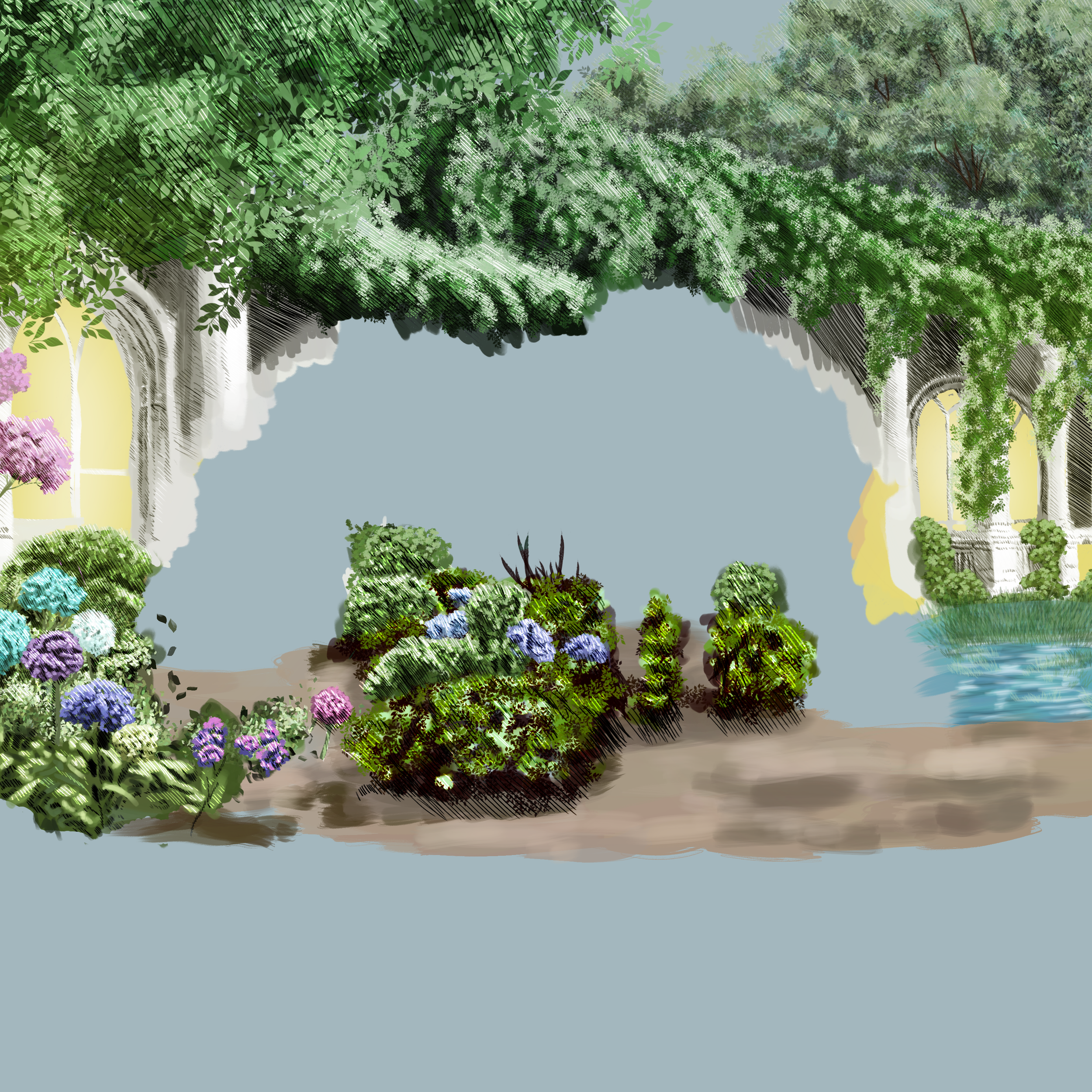
I roughed in the dirt underneath the plants that will be in the midground area.
Now the hatching is applied to the flowers and greenery creating a sense of the plant life being grounded into the dirt instead of floating weightlessly.
The dirt is not fully hatched on all areas and the water area is still not hatched.
This is the current state of the artwork:
Next is my favorite and most enjoyable part. The horse. I could spend weeks or even months just tweaking and reworking any horse image, but backgrounds very quickly bore me to be honest.
The colors are roughed in and the markings are refined until they look right. Each marking/color/detail is a separate layer allowing me to stack and refine without having to go back into previous layers. I work from the broadest level (the base creamy brown color) to the most refined level (the hatching for the shadows and highlights) and in order of the depth at which they stack (base color - markings (in order if there is one as here the white streaks go “behind” the dark brown patches) - mane).
The eye gets a little extra special attention - its not real obvious at this scale, but there are highlights and shadows as well as the pupil in there - it just helps to add to the realism. Keeping away from the flat ineffectual blob of color is a useful and easy technique to add some “real” into your artwork.
This is the current state of the artwork:

Now my rather rough colors and still admittedly blobby textures will begin to take real shape. This is through the magic of masking.
First mask is to remove the majority of the horse from the background. You can see the horse colors peaking through here. I left the background overlapping the horse slightly because a future step is really going to seat the horse into the picture rather than have it floating weightlessly.
This is the current state of the artwork:

Returning to all those layers created before to color the background, I duplicated and then flattened the duplicates down to one single color layer. I then moved this single layer above the new mask. As soon as I set it to clipping mask, the horse’s color popped back through. In the end I made two duplicates and stacked them. The first (bottom) one is set to normal blend mode and at 100% opacity. The second (top) layer is set to linear burn blend mode and at 18% opacity. This really warms the tones up a little more as the background was feeling a little cold from the green color being just a hint to blue when it was all pulled together. This also washed the sky out slightly which helped a bit more.
Now, as seen above, this mask does overlap the horse a bit, but that is not going to create a problem. The next step is going to seat the horse firmly into the scene and going to really amp up the realism in a way that would be difficult to do otherwise in this process.
Side note: I keep all the separate layers as well because if I find that something needs to be adjusted/edited as I move further along, it is much easier to do that with the layers than it is with the merged. All I have to do is re-duplicate and re-merge the layers again and reposition the new merged layer in the right spot and I can delete the erroneous one. Makes editing and tweaking so very much easier. There is probably a way to do this even easier with smart objects or something, but this is the process I have found that works really well for me personally.
This is the current state of the artwork:

I repeat the masking process again, but this time I reverse the goal. I mask in the horse and mask out the background.
The edges of the horse are very carefully done. This took a good while to refine and do. The soft edges of the longer hair like the mane, tail, and feathers on the feet were done with lower opacity and built up so the colors from the background would be pulled through creating that effect of translucency. I captured every little highlight detail in the horse’s edges for rim lighting and detail. I probably spent as long creating this mask and perfecting it as I did coloring all of the background and the horse combined.
This is the current state of the artwork:

I repeat the process of flattening the color on the horse as I did on the background and move that layer above the new mask. It took some real tweaking to get those white stripes on the flank and the shoulder to remain to be seen, but I finally settled on a setup. Again, I ended up with 2 layers.
The first (bottom) layer is set to soft light at 100% opacity. The second layer is set to saturation at 100% opacity.
This really popped the horse out of the background and gave it a warm cast to the colors, bringing up the red slightly. You see a bit more of the graphite drawing at this point, but that’s fine. I want the graphite drawing to help with the texture, and it is going to smooth the texture out over the whole painting by the end. That’s why I spent so much time making it to start with.
This is the current state of the artwork:

I duplicated the mask from when I worked with the background and layered it on top of everything again. This masked out the horse and masked in the background, so it added some of that graphite drawing texture on top to further knock back the intensity a little bit and help make the subject stand out. It also helped create more atmosphere between the viewer and the different stages going all the way back to the bushes peeking out above the structure in the background.
This layer is set to normal and 37% opacity.
This is the current state of the artwork:

Now it’s time to work on the foreground.
I still worked from back to front, and so for this stage I laid in a few stones around the feet and muzzle of the horse. I used the same process I have all along of rough color and then the hatching (in the same direction) for the detailed shadows and highlights using subtract and divide blending modes.
This is the current state of the artwork:

Then I layered in some rough grass. It was done in a much wider range of color values than the bushes and the trees to give more detail in the shadows and highlights from the cast sunlight.
I used the same process I have all along of rough color and then the hatching (in the same direction) for the detailed shadows and highlights using subtract and divide blending modes.
This is the current state of the artwork:

And finally, I laid in the greenery for the hydrangea plants and the others that are in the foreground. Also done in a similar range of values as the grass.
I used the same process I have all along of rough color and then the hatching (in the same direction) for the detailed shadows and highlights using subtract and divide blending modes.
This is the current state of the artwork:

And now the hydrangea balls in the foreground. These are really going to bring the viewer into the scene and make the horse have an enveloped environment. I’m really pleased with how this picture turned out and it is in no small part to the flowers in the foreground to lead your eye around.
All the same processes - rough color, then adding in the shadows and highlights with the hatching.
This is the current state of the artwork:

Almost done now. Just 2 more very simple steps.
First, I layered another copy of the masked-out horse so the whole background was textured by the graphite drawing. This was set as normal blending mode and then set opacity to 37% again. This pushed back the background and foreground to make the subject stand out more. It allows the horse’s coat to really shine.
Last step is the signature. I sign the artwork in a place that is non-intrusive to the viewing, and date it. I set the layer to multiply and reduce the opacity (again to help it blend in, so it doesn’t disrupt the viewability of the artwork.)
This is the final state of the artwork:

Well, that’s it for this tutorial. I know it’s not the greatest example of a tutorial, but using this process you can make something too.
I will be back with more polished tutorials and instruction, but …
Until then…
Take care of yourselves and each other,
Lucy